Here is the use case, I was actually pulling data from Model Driven App. As I was testing my report and cross validating the counts with that of CRM, so, it is when I noted that the count of records getting mismatched exactly by the time zone difference and if you were any other time zone except UTC and using Date Diff functions, you may encounter this problem with Power BI which you should definitely handle.
The Power BI Service will be in UTC time zone. Actually, we can’t set the time zone neither in Power BI Desktop nor Power BI Service, we have to amend the time difference, that’s it.
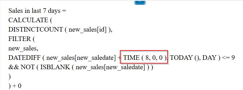
Consider you have a measure which calculates the date difference…consider adding the time zone difference to your DAX measures or using Power Query.
While here I am using the below DAX, I have adjusted here in DAX as below.
While I was in Singapore time zone (SGT), I have added UTC + 8 using the TIME Function available in Power BI and there you go…
Now the numbers should match exactly with that in your DataSource i.e. Power. Apps.
If you want to do this in Power Query based your scenario…you can follow the article in references.
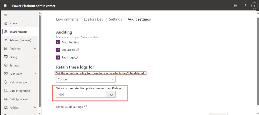
Do you know that you can set to auto delete the audit log information from Admin center. Yes, you can do this from Power Platform Admin center. Of course, this tip is a very small one, not knowing such feature can cost you so much time to figure out the Audit log deletion.
This post is all about embedding Python visuals in Power BI, you will need to install the respective dependent libraries like Seaborn, Matplotlibwhen you were creating visuals as we are using the respective libraries.
Thank you @Dr.S.Gomathi for sharing insights at GPPB Tamil Nadu, 2024, while I don’t know that Power BI has this capability. I am writing this down.
The first thing you need to do is to install Python, you can install the latest version from internet. Click here to Download Python for Windows.
Once downloaded and installed in your local machine, you can find a folder created under your Windows Start menu like below.
You need to right click on Python 3.11(64-bit) icon which is the current latest version and then click on open file location.
Then you will be able to see the contents in the folder
You need again right click on Python 3.11 (64 bit) and open its actual contents where the library files reside.
Copy this path, we need this in a while.
Now open Power BI Desktop and navigate to File –> Options and Settings –> Options
Now in the options and settings, you need to select on the Python scripting and specify the path which you just copied above as below.
Now you were ready to use Python visuals in Power BI.
Next step is to click on Python visual as highlighted below
You will be then asked to enable Python scripts as below
You will need to click on Enable as shown above. Once it is done, you are ready to start using Python visuals in Power BI.
Then you need to load data from your DataSource. Here is the link to the excel I have used. Once data is loaded into your Power BI report, you need to select respective data fields which you want to visualize. Here I am using two fields for X and Y axis, then in Power BI Desktop, you should be able to see something like below.
and in order to effectively visualize the sales trends, I will be visualizing the data using Violin Chart, which is using Seaborn library, while the Seaborn is actually based on Matplotlib library. So, I need to make sure I have those two libraries installed in my machine. You can install by using Command Prompt in your PC, you need to enter below commands and press enter to install.
pip install matplot lib
pip install seaborn
Once installed, we can plot using the below command in the python script tab in Power BI Desktop
This file contains hidden or bidirectional Unicode text that may be interpreted or compiled differently than what appears below. To review, open the file in an editor that reveals hidden Unicode characters.
Learn more about bidirectional Unicode characters
Then you may need to click on run script as highlighted below
This gives your Violin chart showing the sales distribution for different product categories in your Power BI Desktop. If you were facing any problems viewing the report, check the error in the pop-up message displayed by Power BI, you can also follow the Microsoft article on this mentioned in the references.
Hope this helps someone trying to use Python visuals inside Power BI. Same way, you can use different visualizations available with Python which were not available in Power BI by default.