Hi Folks,
This post is a tip which I have implemented in my one of my projects which can help to improve your Power BI Reports accessibility.
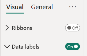
Enabling data labels is a great way to show the numbers in the visual
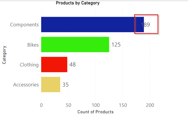
But what if they keep overlapping even though you ensured optimal size and Data labels to be displayed at the Outside end like below. It decreases the report accessibility.
There were two options for you…
- Changing the colors in the theme color
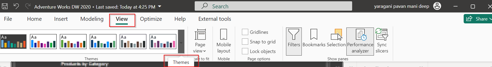
You can change the themes by going to View option if you would like to install the ones available with Power BI, else if you want to install custom themes, you can download them from https://powerbi.tips/ and install.
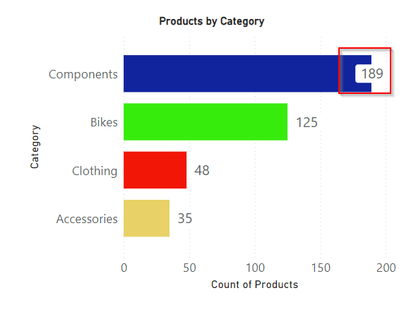
After changing the theme color, the data label is clear and readable and thereby increasing accessibility.

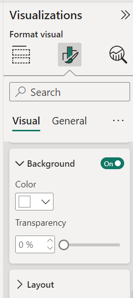
2. Enable background color and set the transparency
This is the other option where you can enable the background for the data labels and set the transparency based on your requirement, it is good to set that to a low number as below.
There it is, now your report looks a lot better for users to read the data labels
Hope this helps someone trying to improve the readability and accessibility of the Power BI Report using the tooltips..
Cheers,
PMDY
Discover more from ECELLORS CRM Blog
Subscribe to get the latest posts sent to your email.
